Lino Printing Revisited

I’ve never been one to make New Year’s resolutions. I’m far too easily distracted. Just one small spark and I’m off diving down another rabbit hole. That said, and this might be the seasonal surfeit of whisky and Drambuie talking, I’ve come to a decision: in 2023 I’m going to concentrate my artistic efforts on Lino printing. 

I had an enjoyable dabble a few years back and even got as far as investing in a fabulous Gunning Etching Press No. 1 in readiness for the flood of prints I’d be making… but I never truly applied myself and just carried on painting instead. I’ve been good at talking myself out of giving it a proper go ever since. 

One reason I love painting in watercolour and gouache is because it’s pretty much instant, sort of. Get inspired, slop some paint about, job done. Next. I like that.

In contrast Lino printing takes meticulous planning, a sharp mind able to untangle mirrored designs across multiple colour layers and oodles of time. That’s a level of mental gymnastics and determination I’m not sure I possess as over the years both my patience and ability to focus have diminished. 

The sharpest tool in the Lino printing box…

And something else has been blocking me. I’ve been dreading sharpening my nice shiny set of Pfeil cutters. What can I say? They’re pretty expensive and I’m ham-fisted, what could possibly go wrong? I know, I know, I’ve just got to buckle up and learn. My tools will become blunt and I will have to sharpen them. Still going to make me sweat though…

All the gear, no idea

So, I’ve got everything I need, cutters, sharpening stones, a strop, Lino, paper, ink and a press. The choice of subject for my first ‘serious’ go at printing might come as a surprise. Ideally I should choose something simple, take baby steps first. A straightforward design in a single colour would fit the bill. That’s what I should do…

…which is why I’ve decided to try my hand at a multi-layer reduction print. A reduction print is one where the design is transferred to a single block of Lino which is then cut away in successive stages. Each stage becomes a separate colour layer on the finished print. Not simple at all then.

Not only that, I want to try using soft colours which graduate one into the other. Again, not the best place for a beginner to start. But I’m going to do it anyway. If I’m going to get stuck in then I prefer to do something really challenging and learn from my mistakes.

A familiar subject

For my first subject I’ve chosen one of my older paintings of the Old Lifeboat Station at Lizard Point, Cornwall. Now I’ve no intention of trying to slavishly recreate this painting as a print, but I do like the composition and misty atmosphere. Initially I’m thinking of no more than 4 layers which increase in tone from light to dark. However, that might be too ambitious and once I start to cut the Lino and get ink on paper I might change my mind…

An acrylic painting of the old lifeboat station at Lizard Point, Cornwall

You’ll see from these progress photos that I’ve already started planning my first cuts. These will become areas of bare white paper on the final print, highlights; the sparkles on the sea. One thing I’ll need to get to grips with learn early on is how the oil-based Caligo Safewash inks mix with each other, their reducer which thins them and the drying gel which speed up the drying process. 

Lino printing isn’t going to be an easy journey but it will be interesting to see what progress I’ll have made by this time next year.

For regular updates please follow me on Facebook, Instagram or Twitter.

Return to the Jurassic Coast

Hello! I’m now back from exploring the Jurassic Coast. We stayed on a smallholding in Melplash, Dorset and it was absolutely wonderful. Lovely friendly hosts and an extremely comfortable cottage. Utter bliss.

Over our two week stay we hit about 62 miles in walks across the stunning Dorset countryside. Have to say, a great many ups and downs were involved and my poor knees haven’t recovered yet!

So many memories…

I’ve been visiting the Jurassic coast, East Devon and West Dorset, since I was about eight or nine years old. One year I remember my grandparents bought me second-hand issues of X-Men number 1 and Thor’s debut in ‘Tales to Astonish’ from the holiday camp shop to keep me amused while the weather was wet. A real treat as I was only allowed British comics at home. Once I’d read them I threw them away of course… If only I knew then what I know now. Doh!!

To be honest the Jurassic coast is positively stuffed with a lifetime of memories. I can truly say that it has shaped the person I am now. It has a way of seeping into your soul. And even though I have a deep passion for Cornwall, the Jurassic coast will ever remain my spiritual home.

…and one we’d rather not have

And so there we wandered; we looked for fossils, visited museums, and marvelled at the night sky while listening for bats and owls. And I did virtually no painting or sketching. Unfortunately, our second week was marred by the utterly awful news that our beloved British Blue puss Genie had died in the cattery. I can’t describe the sense of loss, and our grief blunted our mood for the rest of our stay.

She was extraordinary cat, and had been our constant companion for 18 wonderful years. That’s a huge age for a pedigree British Blue. Our only consolation is that she died peacefully in her sleep. When they found her they thought she was just that, asleep. I can’t express how much we miss her, the house isn’t the same without her soft pad-padding about. No more warm cuddles.

The holloway

Despite that I have still come away with ideas and inspiration. I’ve loads of photos to jog my memory. One place which is definitely going to feature in future work is a holloway close to the cottage, a bridleway and ancient track. Enclosed by bent and arching trees, exposed roots twist from the earth, plaiting themselves into contorted shapes reaching through the track’s gloomy depths.

That damp dark green place really got my imagination fired up. What will I do with this wealth of material? I do have a few ideas which will firm up as I ponder the material I’ve gathered. Watch this space as they say, or better yet my Facebook and Insta feeds…

Holloway Glow
Holloway Glow

Going it alone, Giclee printing 101

My oh my, in just one month how things have changed. In my last post I was prepping a digital file of my ‘Coming Home Tress’ gouache painting for Giclee printing. I wanted to offer it as a Giclee print and was ready to send it to a commercial printer. Spoiler alert, I didn’t.

Instead I had the balmy idea of buying high quality inkjet printer and making my own Giclee prints. I already own a very decent scanner, a MacBook Pro and Affinity Photo. How hard could it be…?

I’ve got a headache…

Well, quite actually. It’s one thing to get your head down, do the research and buy the kit, but quite another to use it in a skilful, coordinated manner.

You can’t just scan a picture and bung it out to the printer. Getting a Giclee print out the other end which honours the original is fraught many pitfalls. Yeh, Giclee printing is harder than it looks.

But then, I knew this. Fortunately, for part of my working life I was a graphic designer. Having worked closely with commercial designers and printers I already had an inkling about what I was getting myself into. To be honest I was hoping that some of their dark arts had somehow rubbed off on me.

I did know I needed to up my colour management game. So I bought a Datacolor SpyderX monitor calibration tool along with their standardised 24 colour target and cube. Adjusting my monitor to approximate the colours I’d print has already been a huge help. And scanning or photographing the colour target along with my paintings gives me a standard colour benchmark to work towards.

I’ve had more than a few cold sweats thinking about how much I’ve invested: new hardware, paper stock and packaging. But, rationally I know this is a ‘good thing’.

Trial by colour

Making the first few prints has been a learning cliff. Each has taken a ridiculous amount of time, but I am getting faster. Slowly I’m beginning to learn which particular settings I should tweak to achieve the colour shifts I need. I’m at the point now where I can predict that what I’m seeing on screen will look right when printed.

Except blues. Blues can be problematic, particularly cobalt blue. Inevitably there will always be some colours which simply cannot be reproduced utterly faithfully. Acceptance of the physical realities I can’t change has been a big step forward for me.

Giclee printing, a few examples

So far I’ve added 8 high quality Giclee prints to my Etsy shop, mostly A4 with a couple of A3. I’ll be adding more week on week but meanwhile here are just three:

A4 Giclee print of The Coming Home Trees
A4 Giclee print of Colmer's Hill
A4 Giclee print of Colmer’s Hill
A4 Giclee print of Klaus the fox cub

So, am I chuffed?

Oh so very yes! The freedom to print my own high quailty Giclee prints is completely game changing:

  1. I don’t have to hold huge stocks of prints just sitting in a drawer.
  2. I can experiment and see how any of my pictures will print without having to think about third party costs.
  3. I can offer you my prints at a more reasonable price, passing on production savings to you.
  4. Not having to worry about additional costs also means I can offer a greater range of prints more quickly.
  5. No more leaving colour matching to someone else. Removing any long-distance to and fro.
  6. No time or delivery bottlenecks, or anxiety about quality while waiting for prints to come back from a print shop.

I am now in a position to offer prints of paintings which would never be available as originals. These paintings are either not for sale or are trapped in one of my sketchbooks. And I’m already plundering them.

My journey with Giclee printing continues, but so far I’m extremely chuffed with what I’ve achieved – insert smug face here… And yes, watch this space!

Footnote:

In case you were wondering, Affinity Photo is an excellent Photoshop look-a-like. I was a long time user of Photoshop, but Affinity does everything PS can in its own quirky way. And for a £47.00 one off payment with free updates it’s far more affordable than Adobe’s ongoing subscription model.

Digitally editing ‘The Coming Home Trees’

Today I started digital editing a scan of a wee 7“x5” gouache painting called ’The Coming Home Trees’. Travelling to Cornwall on the A30 they are a much-loved landmark. They are also called ‘The Nearly There Trees’. This was one of the paintings made when I was painting sets.

Digitally editing 'The Coming Home Trees' a gouache painting
Digitally editing ‘The Coming Home Trees’ a gouache painting

When I ran an Instagram poll months back asking whether people would prefer prints or cards of my paintings. Prints clearly came out on top. Unfortunately at the time I was unable to progress.

Piggy bank willing, I’m now ready to fund a small run of high quality Giclee prints. Giclee prints are made using top-of-the-line inkjet printers which can print onto watercolour paper. While the technology is similar to your home deskjet printer, Giclee printers use 12 or more inks rather than 4. This means they achieve very subtle colour graduations which closely match those in the original painting. It can sometimes be difficult to tell a Giclee print from the original, they are that good.

My process

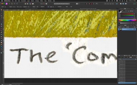
I scan all my paintings as soon as I complete them so I already had a hi-res 32 bit TIF file. My goal today is to remove some of the unnecessary scanned texture from areas of blank paper while retaining the original raggedy edge left by the masking tape. I‘m also cleaning around the pencil writing.

Digitally editing 'The Coming Home Trees' a gouache painting - detail
Digitally editing ‘The Coming Home Trees’ a gouache painting – detail
Digitally editing 'The Coming Home Trees' a gouache painting - close detail
Digitally editing ‘The Coming Home Trees’ a gouache painting – close detail

Mucking about like this reminds me of being back at work where Photoshop was a constant companion. These days I use the excellent Affinity Photo by Serif who also publish the companion programs Affinity Designer and Affinity Publisher. Admittedly the interface can be a little confusing if you’re coming from Photoshop, but with a little time and YouTube videos all becomes clear.

All are very reasonably priced too. Photo does all of what I asked of Photoshop for but at a fraction of the cost. A real biggy for me is that Serif don’t hold you to ransom with a subscription like Adobe.

I’ll composite and position my edited image onto a 10”x8” blank digital master ready for printing. And to ensure the colours and tones remain faithful to the original I’ll be arranging a test print.

When will ‘The Coming Home Trees’ be available?

Soon I hope. I’ve got to source a printer then as long as I’m happy with a test print I’ll list them in my Etsy shop. They will be 10″x8″ total size with the image life-size at around 5″x4″. They will come with a card window mount and there will be an option to have them framed.

Meanwhile, here’s a simulation to whet your appetite (final version might vary):

The Coming Home Trees Giclee print with white mount and frame (composite image)

See you soon,

Ade, 22 July 2022

Welcome (again)

Ade Turner in Damsontree Studios

Thanks for dropping by. It’s been a few years since I added new content here. These days you can catch up with me on Instagram, Facebook or Twitter. Follow me there for my latest news and paintings.

You can also visit my new(ish) Etsy shop for a selection of original paintings and prints. I’ve found it a real game changer. Some balk at Etsy’s fees, but honestly they’re not as onerous as gallery fees. Yes, it means I have to do all my own promotion but for now that’s OK.

Where’s this site content heading?

Years back when I started this site my intention was to blog regularly and occasionally review painting gear. And for a while, early on, I did just that. For a variety of reasons though that petered out. Then, during the early months of the COVID pandemic I almost shut it down completely. Glad I didn’t. Like so many people I wasn’t in the best frame of mind.

A channel like this where I’m free to expand on themes and ideas has its place. I’m not going to force it, but if I have something more ‘meaty’ to present I’ll do it here. I’ll never be a prolific blogger (or painter for that matter) but I will share when I’m ready.

Meanwhile if you’ve not been here before please explore my earlier posts. The topics bounce around a bit, but that’s just me.

My preferred medium has definitely changed

You’ll see a change in preference through the years. I used to see myself as an oil/acrylic painter. My preference now is to work fairly small in watercolour or gouache. I really love the chalky, graphic nature of gouache. So different from the free blending experience of oils. Quickly laying down opaque layers of paint to build an image feels close to magic when it comes together.

I’ll probably dip into oils now and then, but gouache is definitely becoming my ‘thing’.

What about Lino-printing?

Yes, yes, I know. Truth is, I keep putting it off. Since buying a fabulous Gunning printing press way back I’ve threatened to get into Lino printing. And I do have a long-standing project idea, but its stuck in my head. It’s currently filed under ‘how-the-heck-can-I-make-this-work’…

So there you go, a quick update on where I’m at. I hope you’ve explored and liked what you’ve seen. Do pop over to follow me on on Instagram, Facebook or Twitter, or even all three!

Ade, July 2022

Painting sets

What an interesting turn of events. Way back in October I recall saying that I was going to hibernate for the winter. Just chill and take things as they come. No plans for painting, or indeed anything else.  It sort of worked…

…but over the past three weeks or so I’ve already painted more than I did through the whole of last year. I must have been thinking about it on some level, but it didn’t seem to be a properly conscious decision.

I think it started when I watched Tiffanie Mang on Instagram making tiny study pieces in gouache, about 2.5” square if I remember right. And they were gorgeous, like little jewels. 

Small, but perfectly formed

I paint small when I’m sketching outside, but other than that I’ve never set out with the intention of making series of pure practice pieces. Sure, I’ll knock out quick pencil thumbnail sketches when I’m planning a painting, but nothing beyond that. 

So, I rummaged through my stock and fished out a big sheet of 250lb Bockingford NOT watercolour paper. I divided it into eight equal format rectangles each 14cm wide by 9cm high using masking tape.

My ground rules

I wanted to take this opportunity to practice painting fast and, hopefully, pretty loose. I want to make more use of gouache when I paint outdoors. So, I set myself these ground rules:

  • Timing: each painting session to take no longer than 1 hour (later revised down to 40mins). At the end of which time, brushes down whatever the state of the painting.
  • Gouache: I specifically wanted to concentrate on this water-based medium.
  • Big brushes: to force me to paint loose I would use only half inch flats: straight, angled and ‘vegetation’ (that’s a ragged brush, ideal for quickly generating the impression of grass and stems).
  • My usual gouache palette – Cadmium Red Pale, Alizarin Crimson, Ultramarine Blue, Indigo Blue, Cobalt Blue, Lemon Yellow and Cadmium Yellow Pale, Permanent White, Ivory Black, Yellow Ochre, and Burnt Umber.
  • From photos: these were never going to be ‘plein air’ sketches. The photos were chosen ‘at a glance’ they had to appeal to me within a couple of seconds. 
  • Absolutely no tatting! OK, so I broke this a few times…

The paintings

And here are the results. I’ve completed two sets and am about to start a third.

Gouache sketches 2019 set 1
Gouache sketches 2019 set 2

I have to say, the whole exercise has been a bit of a boost. And, the icing on the cake is that they have proved popular, with all but 2 of the first series being snapped up in a couple of days.

Here are my personal favourites so far:

Lizard Point
Lizard Point
The Coming Home Trees
St. Mary's Sunset
St. Mary’s Sunset
Creek at Gweek
Creek at Gweek
Lizard Old Lifeboat Station

The best place to follow my progress as I produce these sets is on my Facebook or Instagram accounts. A few are currently available in my Etsy shop.

Its already shaping up to be an interesting year.

Time to reflect on the good things

This year was always going to be ‘interesting’ and, as the nights draw rapidly in, I’ve been reflecting on my progress so far. You know what, in general I think it’s all been good.

While I’ve not been very prolific, I sense the quality of my paintings has definitely improved. And when I think back to the mental health issues which dragged me down over the past 3 years or so, I’ll take that as a ‘good thing’.

This year I’ve tried not to put myself under pressure to create. I’ve largely done whatever I fancied, and only when I fancied doing it. And if some things have been left hanging, the lino-printing for instance, then so be it. At the moment I’m fortunate in that this is not my prime income and I also have a ‘proper day job’ to pay the bills.

Ade Turner Artist in Cornwall
On my favourite coast path in Cornwall

So, over winter I may not paint at all now I’ve finished my latest commission. I don’t even know yet whether I’ll pick up the lino cutting either. It’s an easier option than painting as I hate to paint under artificial light, even using my wonderful OTT-Lites.

I won’t be idle of course. The new website is still on the cards but, hey, who really enjoys putting that stuff together; it might go to the back of the queue.

I will sort out those Giclee prints I mentioned last time.

And I’ve plenty of non-painty things on the boil too, including decorating (which I hate by the way…), figuring out how to use my new 8” telescope, a couple of 1/10th dinosaur sculptures which I want to prepare, modify and paint. Oh, and Red Dead Redemption II for my Xbox – it is gaming season after all, and I can see myself being lost in that for weeks.

Of everything, I’m hoping the dinosaurs  will fill my time, and fair warning I will be posting progress. At around 30” in length both are ginormous! In fact they are so big I’m not sure yet where I’ll display them once they’re sorted. Well, what can I say, they looked smaller online…

So, a quiet and hopefully relaxing winter and early New Year coming up. I will still be posting on FaceBook from time to time, so head over there and please Like my page if you want to keep up with any updates.

Someday my prints will come…

See what I did there? prints/prince?? Oh, never mind…

Anyway, prints. You will soon be able to buy high quality Giclee prints of a selection of my paintings. First off the mark will be a couple of my latest gouache paintings.

I’ve been working with Sarah at Ironbridge Fine Arts and Framing to colour match the scans of my paintings to be as close as possible to the originals. I’m very impressed! Comparing my paintings and test prints side by side it really is hard to tell at a glance which is the original. 

What is a Giclee print?

Kynance Cove: The Bellows - framed original with Giclee print
Kynance Cove: The Bellows – framed original alongside Giclee print

Giclee prints are made using top-of-the-line inkjet printers. While the technology is similar to your home deskjet printer, Giclee printers can use 12 inks rather than 4. This means they can achieve very subtle colour graduations which closely match those in the original painting. 

During printing the size of the spray droplets varies which makes for a less ‘mechanical’ finish. And the ink is archival quality so each print will have a long life with less likelihood of fading.

Once printed onto an acid-free, lightly textured watercolour paper the results are brilliant.

Which paintings will be available?

To kick things off I’ll be offering two recent gouache paintings:

  • Kynance Cove: The Bellows (featured above)
  • From Pen Olver to Lloyds Signal Station

From Pen Olver to Lloyd's Signal Station
From Pen Olver to Lloyd’s Signal Station

I will be offering both unframed without a card mount. Besides giving you the freedom to present them exactly how you want, this also means I can keep the price point affordable.

I’ll post up full details of price, size etc. once I’m ready to go, most likely mid to end of October (I have a holiday coming up very soon). 

Update: Kynance Cove – The Bellows is now available in my Etsy shop.

Going all gouache

Over the years I’ve used, and dabbled with, all manner of media. Ive tried watercolours, gouache, oils, alkyds, water soluble oils, acrylics, acrylic ‘ink’, traditional inks, silk paints, coloured pencils, charcoal, Conte crayons, graphite sticks and pencils, and pastels. And probably a few others. My art drawers are crammed full of ‘interesting’ tubes of stuff, all are slowly fading away in the darkness, some sit alone and unloved. 

What’s your medium?

If you’d asked me a few months ago “which is your medium”, I’d have said oils without hesitation.  Today I’m not so sure, because I’m beginning to think it might be actually be gouache. Maybe…

I’ve used gouache on and off for over 20 years, but not in a sustained way. A handful of small monochrome illustrations when I worked as an illustrator and more recently for occasional plein air holiday sketches. I think over time I’ve absorbed a negative notion that gouache paintings are held in low regard as a painting medium. I’ve seen them criticized because they can produce ‘chalky’ work which is over-stylised and too graphic. Not a serious medium for serious artists then…

It was only while confined to our holiday cottage on a drizzly day in June (remember drizzle…?) that I started a ‘proper’ painting in gouache. I’d deliberately left my oils at home, so it was Hobson’s choice – pure watercolour or gouache.

The painting

And here is that painting: Towards Lloyd’s Signal Station from Pen Olver’.  It’s on 450gsm Hahnemühle 50cm by 20cm NOT watercolour paper. Looking back, I was surprised how much brighter and more colourful my gouache paintings seem compared to my plein air oils. 

I roughed in a tonal underpainting using Turner acrylic gouache. Despite its name I don’t see it as a real gouache. It’s basically opaque acrylic paint suspended in a matt binder. For me it doesn’t ‘feel’ like the real deal. However, being acrylic I could paint over it without lifting any colours. 

Now I’ve gained a little more experience I’m not sure I’ll use the acrylic gouache again. I’ll probably make my underpainting direct in Winsor & Newton Designer’s gouache. They have a lovely creamy feel, are well saturated with pigment and dry to a velvety matt finish. 

However, brushstrokes must be confidently placed and then left well alone. Prodding and poking at a newly laid wash overlying a previously layer can lead to unexpected results. Sometimes this gives rise to ‘happy accidents’, but most often it results in a mucky mess. It’s this need for confident handling which determines the characteristic look of many gouache paintings – think old railway posters. 

The more I work with them, I’ve found I can make blends up to a point, but laying a thin glaze over previous layers is asking for trouble.

Conclusion?

I am still finding my way. With my latest painting, ‘Ancient Landscape’, I feel I’m pushing against the limits of layering. Some areas sport about 10.

Gouache painting: 'Ancient Landscape'. Chun Quoit, Cornwall, West Penwith, near St Just.
Ancient Landscape

On balance I think I need to try and achieve my goal in as few layers as possible, which means cultivating and maintaining spontaneity and confidence in my brush work. More practice then!

A change for the better

There’s a definite whiff of neglect in here isn’t there…? A lot’s changed since last I was here.

Long story short, I’m feeling better than I have done in years, but let’s have a quick catch-you-up:

  • Over the past 3 years my mental health has been on-and-off grim with the second half of 2017 being particularly awful.
  • However, since Christmas a switch seems to have flicked and I’ve seen a real, rather than temporary, improvement.
  • Don’t care what’s actually changed, I’m now feeling great.

There, all caught up. Well, nearly.

If you  follow me on Twitter, Facebook or Instagram you’ll realise that I haven’t been idle. In fact there’s been a few big changes:

First I’ve had a Booth’s garden studio installed in the garden, 21’ by 9’ – internal size.  Sadly, that’s not all for me. My wife Carole is a spinner and weaver, so half (plus) is set up with her looms and other mysterious textile hardware. She’s rather good at it too! Strange how it already feels so small…

Second, I ordered an etching printing press number 1 handmade to order by David Gunning’s team at the Ironbridge Fine Arts & Framing. I’ve only dipped into linocuts a couple of times, but really enjoyed it… apart from printing using the back of a spoon. Results were very mixed and I could see that it wasn’t going to be a fun way of producing more than a handful of prints – hence the press.

Third, I think I may have finally found my ‘thing’. I’ve always thought that oils were my ‘go to’ medium, but lately I’ve been getting really encouraging results with gouache (see my site banner). I can see real potential there.

More about all of the above soon, hopefully with pictures too!

Finally you might have noticed I’m trying to tidy this place up. So, if you find something doesn’t work, has gone missing or looks odd, it’s just me tinkering.

I’ve recently had a merry few evenings writing my privacy policy and cookie information pages – with GDPR there’s so much to take in, and all the advice I’m finding assumes you have some kind of in-house IT team to sort these things out. Well sadly I don’t, and it’s making my brain hurt.

Back soon(ish)

British Landscape Painter